
Predicting the direction of website design
Musings on what's coming next

I’ve always been mildly fascinated by website design. What styles are considered aesthetically best gradually shifts over time and we often get a distinctive old-timey impression from older websites.

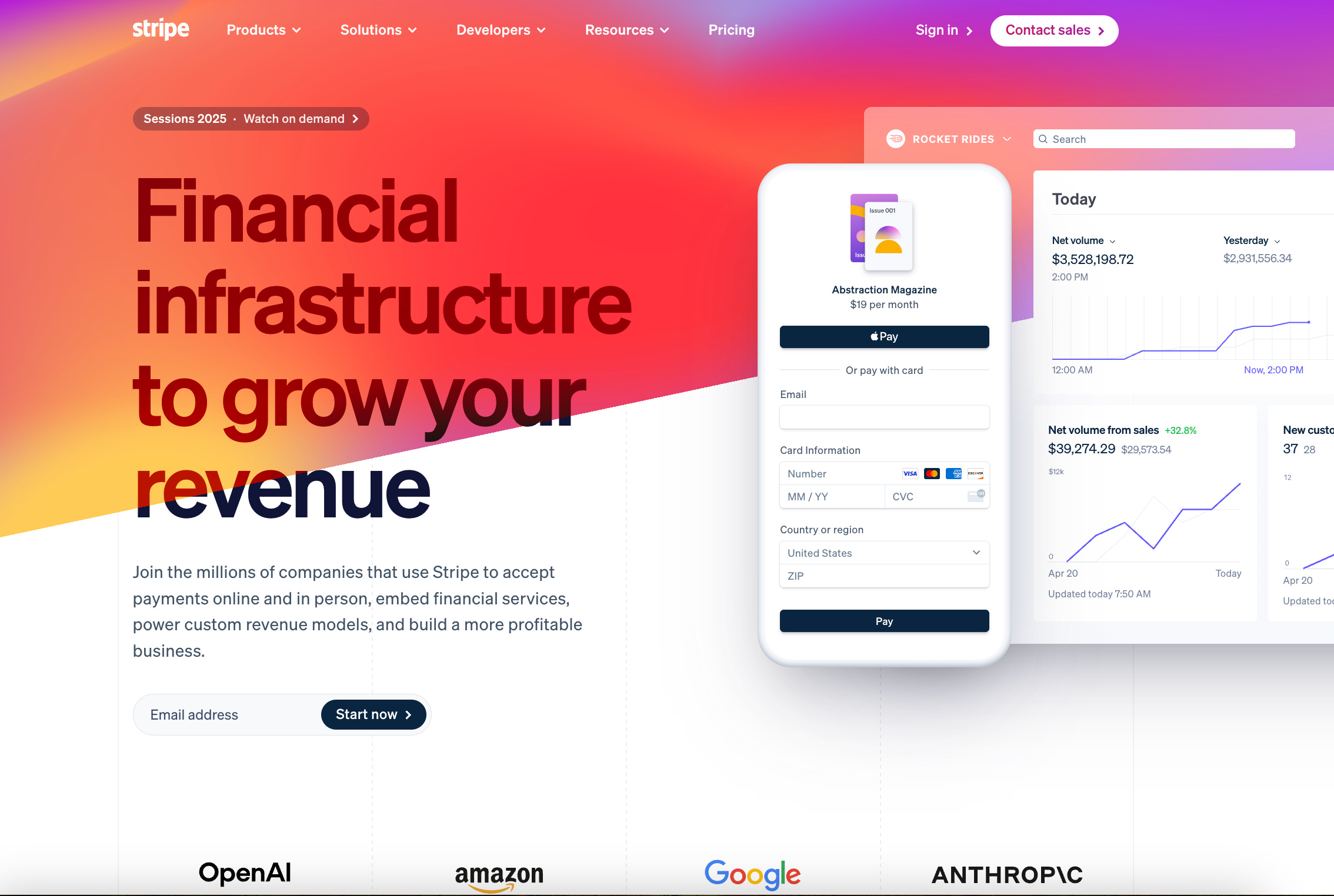
Back when I used to occasionally skim /r/UI_Design/, they would regularly cite the Stripe website as an example of cool web design. When I first visited it in 2021, I remember thinking oh, that’s what the coolest modern websites must look like. But now I look at it and it reminds me of dozens of other company landing pages. The animated gradient is no longer as novel, the clean icons and semi-transparent elements are no longer as striking.
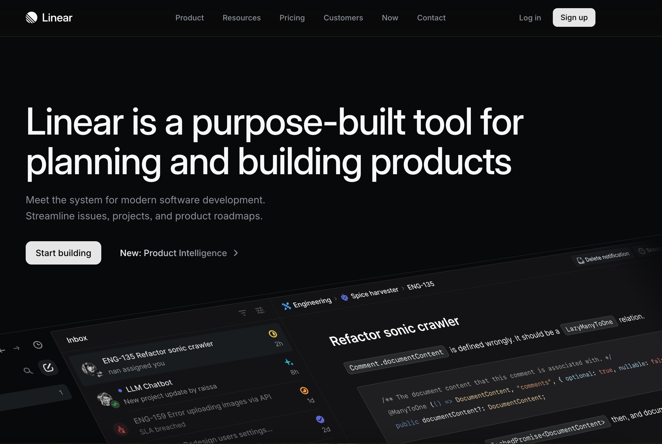
Its successor is probably something like the Linear landing page, which also employs heavy use of crisp semi-transparent graphics and product screenshots.
Now there’s a new trend. Retrofuturism and naturalism (and their combination) are increasingly dominating the design choices of hot new startups.


Designers are moving from cooler to warmer tones, embracing lighter color schemes, moving from sans to serif or monospaced fonts (with a general increased attention to typography), and adopting “trad” company names like “The Browser Company of New York” and “Daylight Computer Company”.
Features that are decreasing in popularity include rounded corners, gradients, shadows, and fancy glass-like effects. These are being replaced with a flatter, sharper look.


It’s not just my observation. The Wikipedia page on “flat design” describes how the trend has gone full circle from flat to skeuomorphic and back to flat.
Websites of the 2010s and early 2020s were trying to say “look at how technologically advanced, modern, and sleek we are” (often using “neumorphism” or “glassmorphism”, a medium between skeuomorphism and flat design that emphasizes transparent effects and subtle shadows).
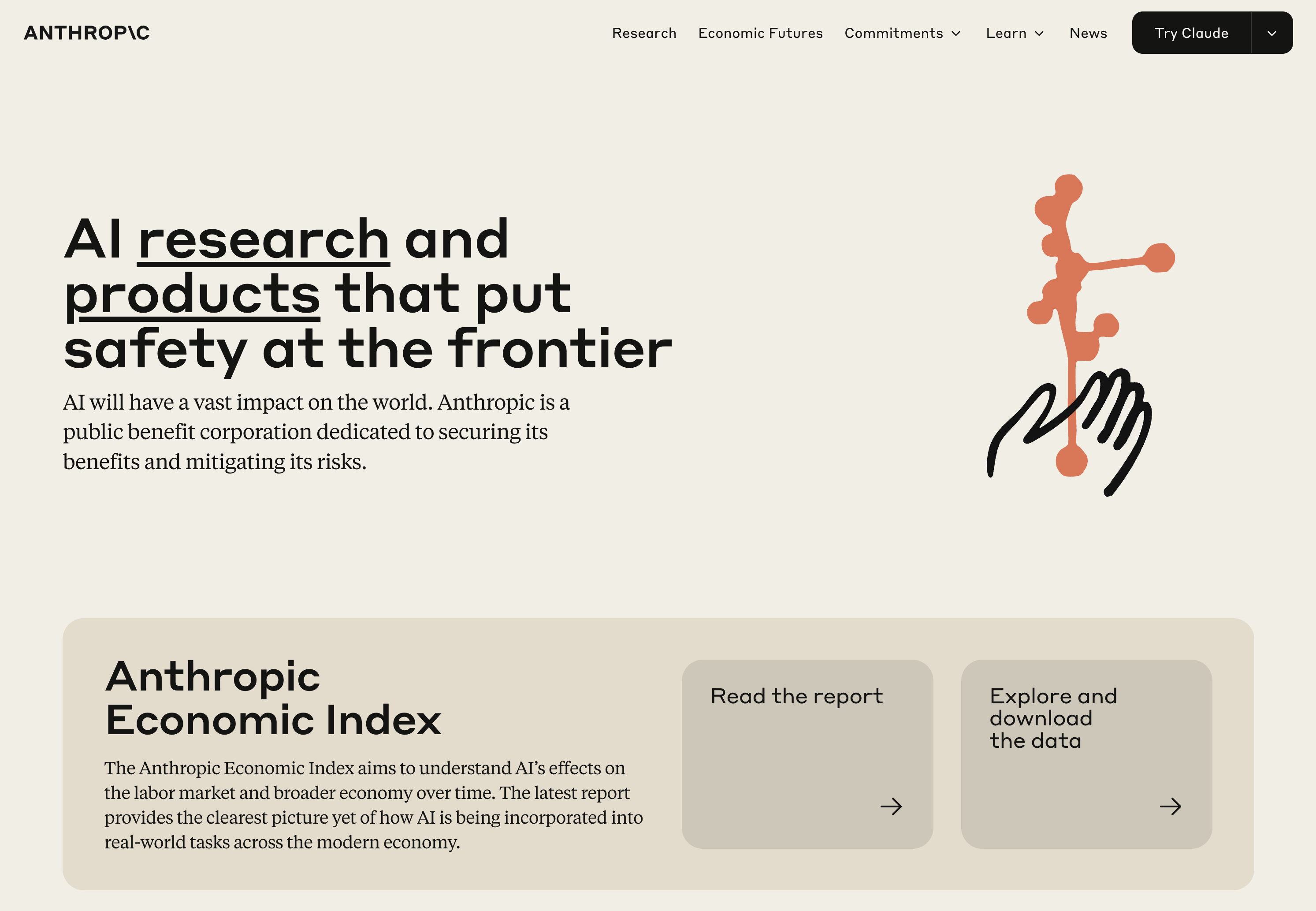
But people aren’t as impressed by gradients and skeuomorphic effects and fancy animations anymore—they’ve seen it all before. Instead today’s websites are often trying to evoke non-technological themes like nature and physical books, or show technology as embedded in the natural environment. For example, Anthropic’s landing page fits this general theme—it uses warm tones, serif fonts (in some places), and hand-drawn graphics.
Another good example of this design direction is the Works in Progress website:
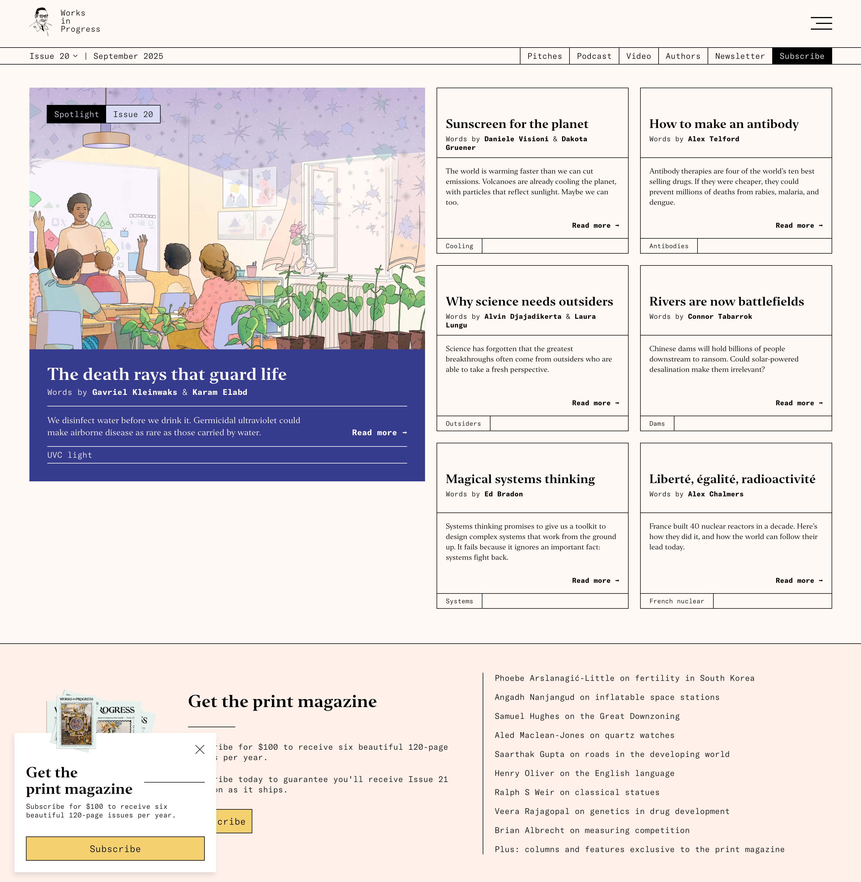
Note the light and warm colors, lack of rounded corners/gradients/shadows, general flatness, and use of monospaced font (GT America Mono Light), a subtle nod to retrofuturism. (Their serif font is Editor from Indian Type Foundry.)
Works in Progress is designed by And-Now, an agency that appears to have designed many “progress studies”-and-adjacent websites. Their work is pretty consistently of a high quality and reflects what appears to me as the current frontier of website design fashion.
I won’t miss an opportunity to praise LessWrong, who adopted a similar style “before it was cool”:
So what’s next? Can we predict what’s coming?
It seems like the evolution of web design is influenced by many contingent factors and is hard to predict. But with the increased salience of AI, probably the blending of traditional, humanistic, natural, and retro elements with modern, clean, minimalist design will continue to be popular.
Aside on LLM-driven web design
If you write frontend code with LLMs, you’ll notice that they produce very similar-looking design styles (across both models and prompts). I’d describe this dominant style as very 2020.
Here are some examples of outputs for different models. The prompt was:
Use tailwind and react to design a nice-looking landing page for my app. The app helps people discover new audiobooks and podcasts based on their interests. It’s called “hearme”.


Most of these websites had cool little animations that you can’t see with just screenshots. If you scrolled down there were additional sophisticated design elements. Here are some links so that you can see live versions:
Notice how similar these are to the glassy Linear-esque style, especially ChatGPT’s output. Websites with this look are now the “it’s not just X—it’s Y” of UI design. Until people solve the problem of precise style elicitation, avoiding this look lets you signal that a human somewhere in your company decided to make intentional design choices.
How to use LLMs for frontend development without your website looking generic
LLMs are good at efficiently churning out React components. The best approach I’ve found to capitalizing on this while avoiding the generic 2020 look is by refactoring any LLM-written code to centralize the styles in a single CSS file, and then tweaking that file myself. If you’re using Tailwind, the model will usually repeat the same string of Tailwind selectors for similar elements, and so you can just move those out into classes using Tailwind’s @apply directive. This way you’ll get a natural distribution of styles that cluster together (i.e. this string of styles will apply to all action buttons, this string of styles will apply to all headings, etc.). The LLM is doing the meta-design (grouping elements into what should look consistent), and you’re making the final look choices.
There's also what you could call the "Berkshire Hathaway revival" style, which uses almost no CSS -- e.g. SALP (https://situationalawarenesslp.com/), NFDG (https://web.archive.org/web/20250328161819/https://nfdg.com/ and https://aigrant.org/) or the old SSI website (https://web.archive.org/web/20250101043240/https://ssi.inc/)
h/t Jasmine Sun, who wrote a very nice three-paragraph thing a few months ago about trends in AGI-adjacent web design: https://joinreboot.org/p/macrodoses-7#%C2%A7a-site-for-every-soliloquy.
Thanks for compiling these examples